Visualizations
A picture is worth a thousand words.
Visual analytics can be a powerful tool for sharing research outcomes with diverse publics. They illustrate qualitative and quantitative information in graphics and figures that communicate complex patterns, relationships, and contexts between scientific concepts and theoretical frameworks. Adding a spatial dimension to the presentation of data enables a richer understanding of concepts, ideas and theories by engaging our visual pattern recognition and spatial reasoning abilities (Risch, Kao, Poteet & Wu 2008). In addition, visuals reduce the complex cognitive requirements for processing information and enhance our ability for synthesizing data and gaining insights on its meaning and / or implications (Keim, Mansmann, Schneidewind, Thomas, & Ziegler, 2008).
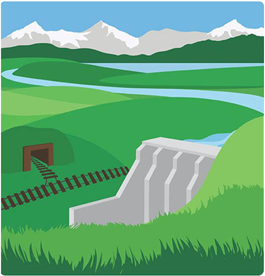
Model Explorer for Community Development Scenarios
Developed by Spaces, Places, and Possibilities
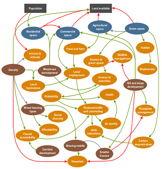 |
The 'model explorer' communicates the process and outcomes of an integrated community scenario modelling exercise done in Squamish, BC. A participatory approach was used for the model and scenario design, and it was done in four stages: (1) designing a systems model and community scenarios (i.e., different community development patterns), (2) modelling the scenarios, (3) evaluating the model through community focus groups, and (4) refining the model and scenario based on the feedback. The model explored a variety of factors including access to amenities and education, walkability, parks/trails, food and farm systems, public transit, housing affordability, threats to critical habitat, etc. |
Visualizations for Community Development Scenarios
Developed by Spaces, Places, and Possibilities
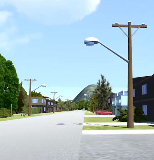 |
Visualizations were created that depicted different community scenarios (i.e., ways the community can develop), which were developed through an integrated community scenario modelling exercise done in Squamish, BC. Methods for building the visualizations involved a combination of mapping technology and video game development software, and they were developed as realistic, immersive virtual environments. Users can navigate the visualizations from the first-person perspective and toggle between (and compare) scenarios using keyboard commands. |
Change in Canada: Future Scenarios
Developed by Meeting the Climate Change Challenge
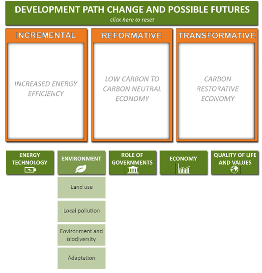 |
The interactive scenarios below allow you to explore three alternative future development paths for Canada - incremental change, reformative change, and transformative change. Click on one of the five categories - energy technology, environment, role of governments, economy, and quality of life and values, and a list of items related to its respective category will appear. Click one of the items to see the different outcomes associated with incremental, reformative and transformative change. To reset and collapse all categories, click the title at the top of the scenario explorer. |
The Role of the Province
Developed by Meeting the Climate Change Challenge
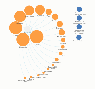 |
These interactive maps summarize data from MC3: Meeting the Climate Change Challenge to show the role that the BC provincial government played and is playing in local climate innovations. The research project had two phases, the first from 2012 to 2014 and the second from 2015 to the present. We mapped how often the word 'province' was mentioned in all the interviews to compare whether its roles were different in phase 1 or phase 2. The second phase has fewer data points, as interviewees included a sub sample of the original 11 case study communities. |
Development Path Change
Developed by Meeting the Climate Change Challenge
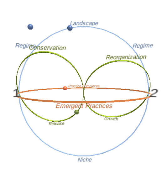 |
This interactive model was developed through the Meeting the Climate Change Challenge (MC3) project, and it serves as a step toward better understanding changes in development paths. It does this by exploring change through three theoretical lenses - multi-level perspective (MLP), social practice theory (SPT), and social-ecological systems (SES). It then integrates these perspectives to illustrate how each theory complements one another and ultimately provides a more comprehensive picture of how different forms of change occur. |
Emerging MC3 Data: Phase Two
Developed by Meeting the Climate Change Challenge
|
The research project, MC3: Meeting the Climate Change Challenge has two phases. The first phase, 2012—2014, interviewed 11 local government climate innovators. The second phase of the research, as one of its deliverables, re-interviewed a sub sample of the original interviewees in order to track if any changes had occurred in their development paths. Included in this sub sample were interviewees with the elected officials from the virtual conversations led in the first phase. |
|
Prior to analyzing the second interview data, we revised the coding framework used in the first phase and ensured consistency with the three theoretical lenses we were using for the second phase of the research—socio-ecological systems, multi-level governance and social practice. With over one hundred interviews across eleven local governments, we then analyzed all of the interview transcripts around 80 refined codes (referred to as topics). Next comes the fun part: asking questions of the data. What is the number one topic across all the local governments? Which local governments are most closely linked in their vocabulary? What are the topics hardly anyone is talking about? How do the topics change from year to year? The visualizations below apply these questions to the interview data and reframe them in an engaging, visual way. Click on the images to explore. |
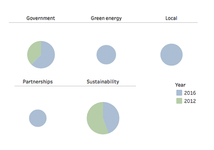 Top Topics Overall |
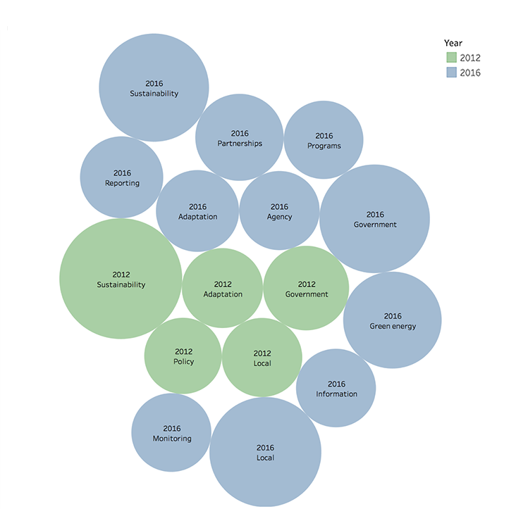 Topic Richness |
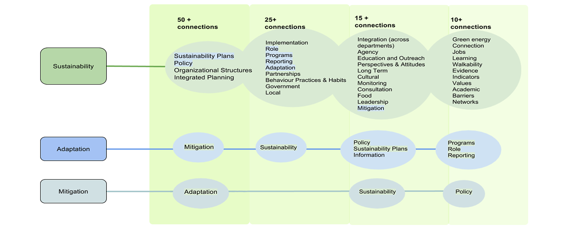 Umbrella Topics |
A Picture of Electrical Energy Use in Canada
Developed by Community Research Connections and Meeting the Climate Change Challenge
 |
This interactive visualization was developed through the Community Research Connections (CRC) program and Meeting the Climate Change Challenge (MC3) project, and it explores Canada’s electrical energy production and consumption over the last 50 years. We invite you to enter this visualization and explore the last half-century of Canadian electrical energy use, looking at where our electricity has come from, how much we have produced, and what our levels of usage have been. |
Keim, D. A., Mansmann, F., Schneidewind, J., Thomas, J., & Ziegler, H. (2008). Visual analytics: Scope and challenges (pp. 76-90). Springer Berlin Heidelberg.
Risch, J., Kao, A., Poteet, S. R., & Wu, Y. J. J. (2008). Text visualization for visual text analytics. In Visual Data Mining (pp. 154-171). Springer Berlin Heidelberg.


